
Mobile app review: Runtastic Balance
- Posted by Dmytro Brovkin
- On October 11, 2017
- 3 Comments
- mobile app development, mobile app redesign, mobile app review, runtastic balance
Runtastic is a digital fitness company that has launched the Runtastic Balance app that helps users to build healthy eating habits.
According to the World Health Organization (WHO) research held in 2014, about 1.9 billion adults over the age of 18 are overweight, and 600 million of them are obese. More than ever, there is a need for the dietary control to limit the intake of excess calories. In addition, lack of information about food is a major cause of obesity as a factor that hinders healthy eating habits.
Runtastic, a subsidiary of Adidas, has been offering a wide range of sports and fitness apps, products and services, including GPS Running Tracker app, Roadbike app, Sleep Better app, Six Pack app, Leisure App, and Smart Band Orbit. According to Runtastic, its newly launched Balance app helps users to track their food intake and to form healthy eating habits.
After this brief information about the app, let’s see how it actually works and how many issues/possible improvements it has.
Diary screen
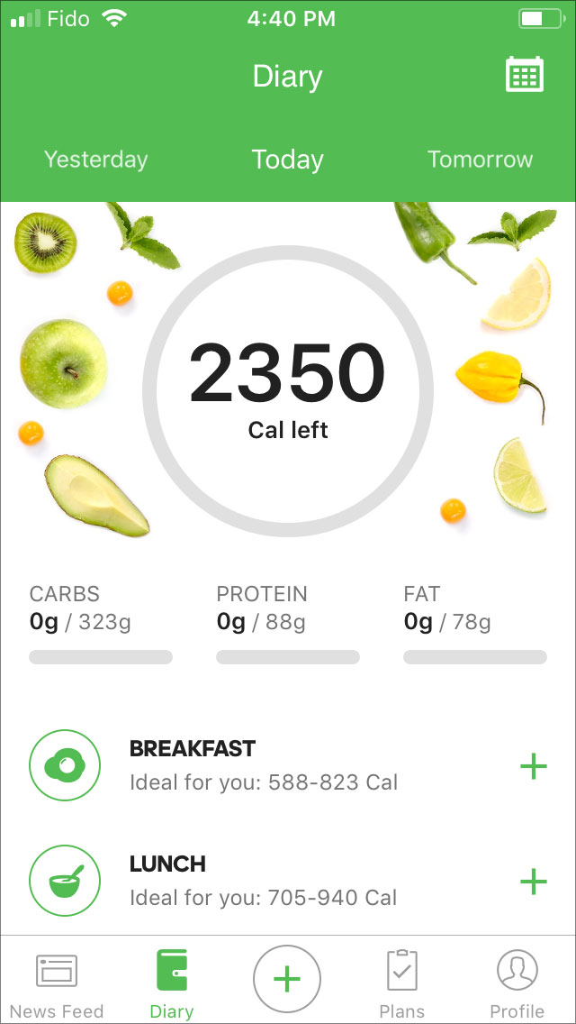
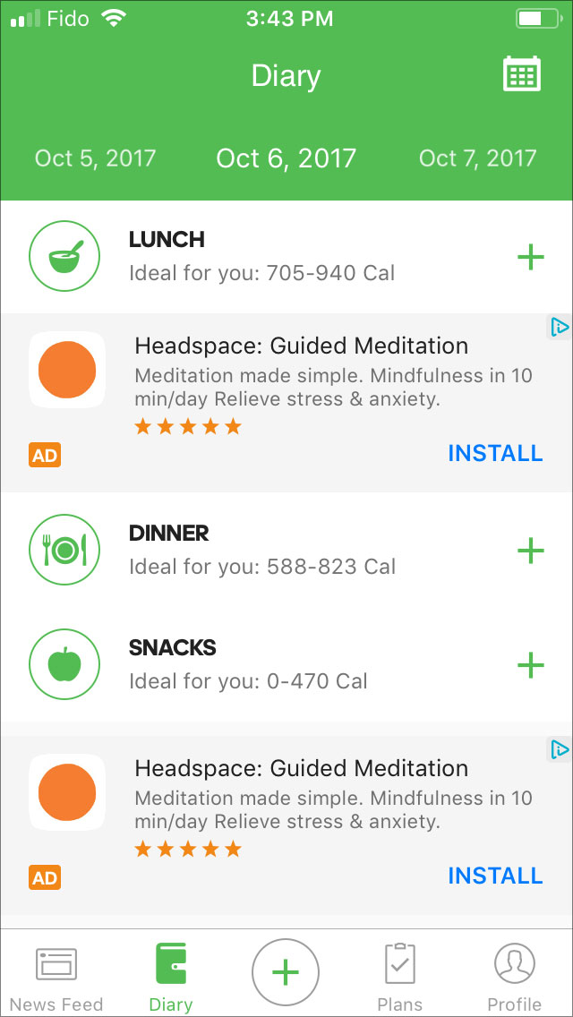
This is the main screen of the app. It’ll appear once you fill your personal information.
Things to improve:
- Too much of advertising (2 blocks, in 1 view)
Log food screen
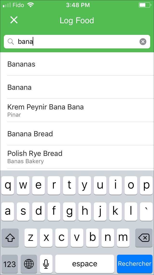
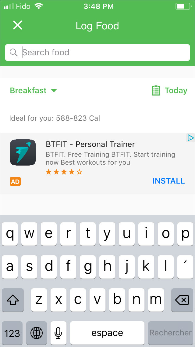
This is the screen where you can look for the food items and add them to your food list.
Things to improve:
- When you type “banana” in the search field, 2 similar results will be shown: “bananas” and “banana”. This might be confusing.
- Advertising block: you have already seen 2 of them on the previous screen.
Plans screen
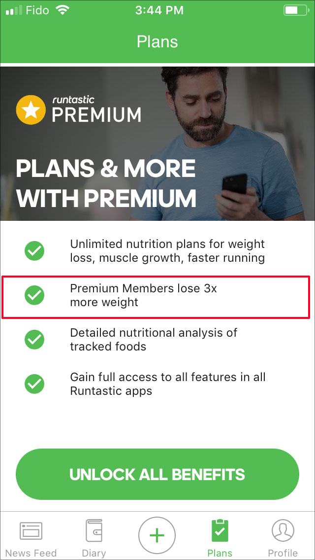
This is one of the screens from the bottom navigation panel. Here you can subscribe for one of the available subscription plans.
Things to improve:
- Statement “Premium Members lose 3x more weight” seems unclear as how anyone can start losing more weight just by becoming a Premium Member?
Profile & Settings screen
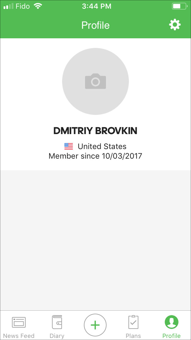
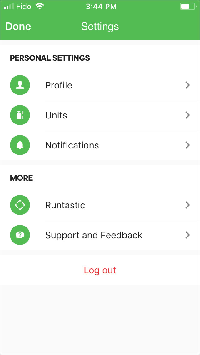
The last screen from the bottom navigation panel. It displays brief information about the user with an option to modify it.
Things to improve:
- Profile photo was loaded only the third time this screen was opened. All the previous times it contained image placeholder.
- This screen shows only 3 UI elements: User profile, Country of origin and Member since date. The rest of the view remains empty.
- Despite the fact that “Profile” screen is almost empty, you have to press “Settings” button to modify any info.
- Support screen takes around 7-10 seconds to load.
Possible solutions:
- Merge “Settings” and “Profile” This way users won’t see the half-empty screen and they’ll be able to modify profile’s info without additional actions.
- Consider implementing “Support” screen with native solutions, not a web view.
Feed screen
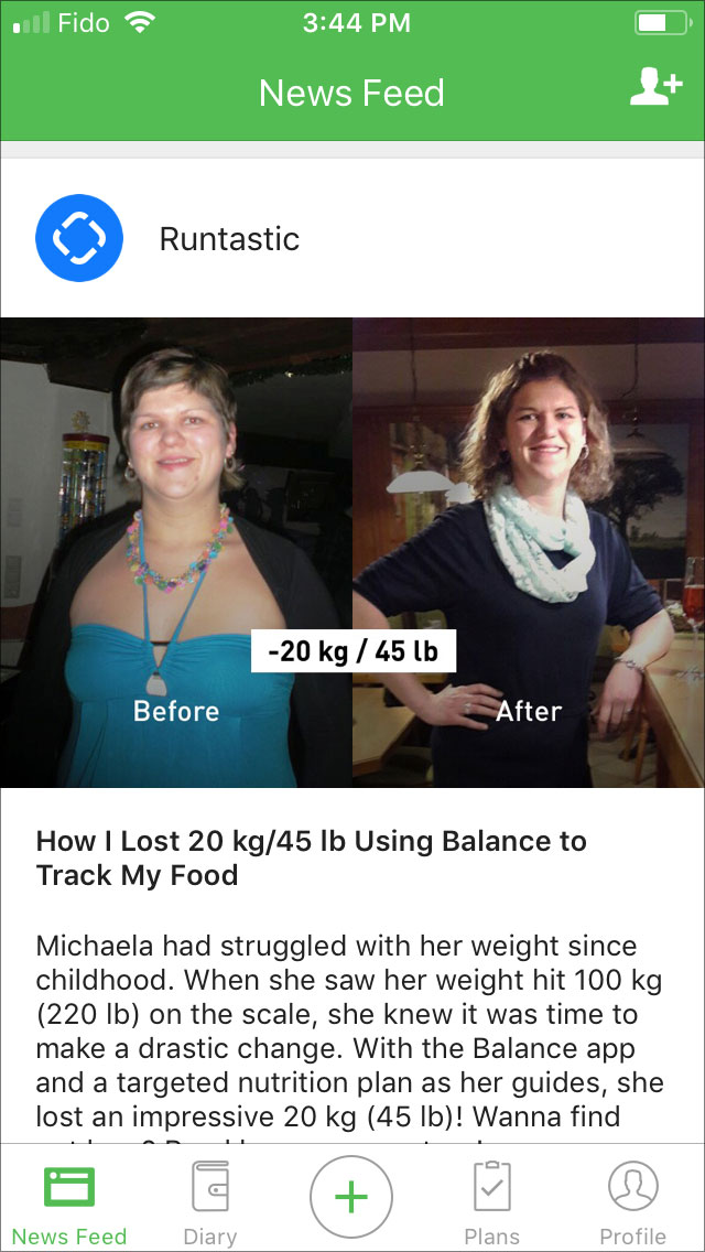
We’ve left this screen for the dessert because in our opinion it contains the most interesting cases of the review.
Things to improve:
- The feed contains posts only from the Runtastic company.
- You can’t create a post.
- You can’t react to /comment/ share the post.
- Once you tap on the post, you will be redirected to the mobile version of the Runtastic’s blog.
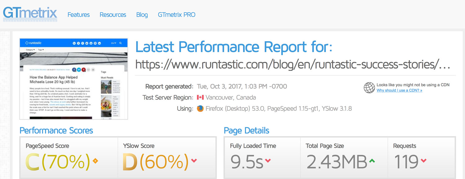
- Each post of the blog loads in general around 7-10 seconds which is too long. At first, we thought that the Internet connection wasn’t good enough, but after testing the blog’s article with GTMetrix everything got clear (see the screenshot below).
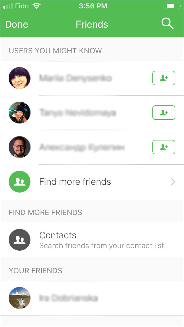
- The application allows you to add your friends from Facebook or Contacts to your Friends list in the app without any further possible interaction with them.
Here are some thoughts about the last statement. It’s not clear what is this feature (Adding friends) for, as users can’t create, react to or share posts. Nevertheless, users can still add someone to their Friends list. Well, we’d added one friend just to test this feature. As the result, once the request was approved, we became “friends” in this application and after that a newly added friend’s profile showed up under the “Friends list” table and that’s it. You can’t view your new friend’s profile, send them a message or see their posts, etc. There is no way to interact with your friends within this app. The need for this particular feature is unclear, at least for now.
Possible solutions:
- Change the feed business logic.
- Would be great if you could share your success story with others. For example, you take a picture of yourself before using the app. Then you take pictures each week/month as you follow your nutrition plan. Once the plan is completed, and you achieve desired results, application will create the story of success using these photos and will offer to share it so that other users get inspired.
- Reconsider “Add friends”
Summary
The Runtastic Balance app is designed for people who wish to: gain/lose weight, eat healthy food. It includes more than 600,000 food-related library functions, providing nutrition information for each food item to the user in great detail. Users can use this information to become more selective and be conscious about their calorie intake. Based on the information users provide when they register, the app can calculate the percentage of carbohydrates, protein, fat as well as the ideal amount of calories they can consume a day.
However, there are some features that should be improved or reconsidered. And we are sure, that it will be done after reading this article. It would be also nice to reduce the number of the advertisement in the free version of the app.
Leave your comments and thoughts about this review below, and don’t forget to share it with your friends.
Application version: 1.0.1
Bugs found: 0
Potential issues found: 14
Devices: iPhone SE/7
OS: iOS 10/11





3 Comments