
Mobile app review: Zen app
- Posted by Dmytro Brovkin
- On October 18, 2017
- 0 Comments
- health app, meditation app, mobile app development, mobile app redesign, mobile app review, zen app
For a lot of people, technology can feel like the root of all the stress. A constant torrent of emails, social media notifications, text messages, and chats can be overwhelming. At the same time all those gadgets, apps and even your favorite but yet pesky smartphone can be used as tools for improving your mindfulness.
If you want to live a happier, healthier and more balanced emotional life, Zen is the perfect app for you. It offers a lot of cool features and here are some of them:
- Weekly newly guided meditations for relaxation.
- Audios and videos for relaxation and meditation.
- Deep sleep music and morning music for positive energy.
- Mantras for health, love, happiness, deep sleep, and anxiety relief.
It’s worth mentioning that this mobile app was also included in the “App Store Best of 2016” list.
Let’s take a closer look at this app and find out how it actually works, and how many things to improve we can find.
Main screen
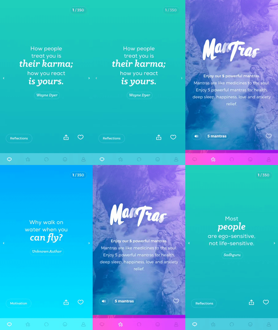
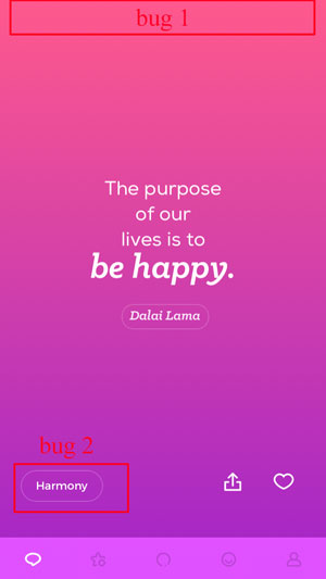
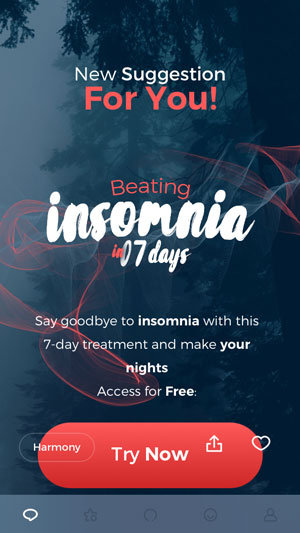
This is the main screen of the app. It appears right after the application starts, there’s no need to log in.
Bugs:
- When switching between screens of bottom navigation panel, the view has a “bouncing” effect at the top of the screen.
- The button in the left bottom corner (“Harmony”, “Reflection”, etc.) is shown with the left to right expanding animation.
- On the offers screen (the one with the “Try now” button) if you scroll and do not take your finger off the screen, icons like “Share”/“Like” will still be visible.
Things to improve:
- Bottom navigation panel icons are too small, especially on the big screen phones like iPhone 7,8 Plus.
Relaxing songs & Meditation screens

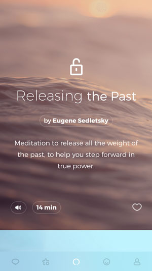
These are screens number 2 and 3 on the navigation panel. It’s difficult to distinguish what is the difference between them at the beginning. Only after spending some time you can see that the second screen contains albums with the relaxing tracks, and the third screen contains meditations only.
Things to improve:
- The difference between screens is unclear.
- There is no separate view with “favorite” content. If you tap the “heart” icon to mark meditation as “favorite”, it will be shown on the same screen and mixed with non-favorite content.
Possible solutions:
- Merge “Relaxing songs” and “Meditation” screens
- Consider moving user’s favorite content to the separate screen.
Relaxing sounds detailed screen
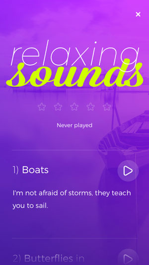


Once you select one of the albums, you will find yourself on the screen with all the album’s tracks.
Things to improve:
- The rating tool (5 stars) is dimmed and remain inaccessible even if you play one of the album’s tracks.
- The screen with the player controls is shown only for a second, and the user is automatically brought to the screen with the animated background. Moreover, there’s no way you can go back to the previous screen. This screen doesn’t respond to the tap gesture. You can only tap “I’m done” button, which will bring you to the “Album’s description” screen. No way to pause/resume the track as a result.
Mood screen
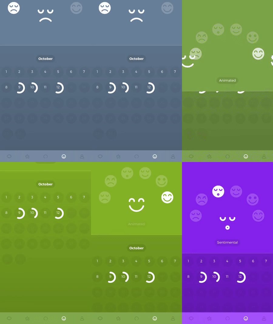
This is the screen where the user can keep a track of the each day’s mood.
Bugs:
- When you change different mood types, the whole view has a “bouncing” effect. We should admit though that this effect gets reproduced only on the iPhone SE.
Profile screen
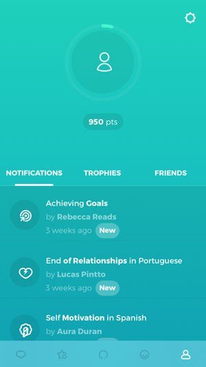
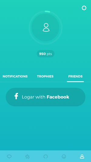

And finally, the last screen – “User profile”. It contains 3 subcategories: “Notifications”, “Trophies”, “Friends”.
Things to improve:
- You can’t interact with notifications in any way. Moreover, it’s hard to understand what they are all about and who they are related to.
- “Friends” category offers you to sign in with Facebook, and English version of the app contains a typo “Logar” instead of “Login”.
- Even if you log in, your friends list will be empty. Maybe it’s related to FB friends who are using this app. It would be great to have an option to invite even those friends who aren’t using this app yet.

Also, “Friends” subcategory has a few bugs:
- If you select “Friends” subcategory and slightly swipe to the left, “Trophies” header gets selected instantly, but in fact the user remains in the same “Friends” subcategory.
- Select “Notifications” subcategory and scroll to the very bottom. Then select the “Friends” tab. At this point, the user is stuck, and it’s not possible to scroll up unless you change the tab back to “Notifications”.
Settings screen
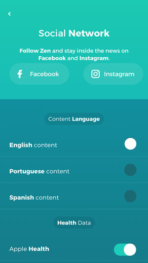
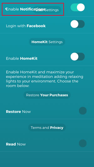
Once you tap “Settings” button on the “Profile” screen, this screen shows up.
Bugs:
- “Back” button, “User settings” header and “Notifications” button are all intersected in one place.
- “Restore now” button doesn’t work. The user won’t be able to restore any subscriptions. This defect is critical because Apple doesn’t usually let such things pass the app review.
Things to improve:
- If you tap to change the language, the application won’t bring you to the main screen. This might be confusing. It would be better to show a pop-up clarifying that the language is changed, and leave the user on the same screen.
Terms and Conditions screen

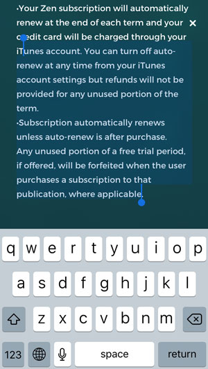
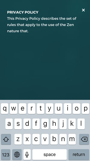
As usual, we’ve left one more screen for a dessert. At first sight, it’s a regular screen with the terms and conditions of the app. But the thing is, that the developers made it possible for users to modify them. You got it right, you can modify or even delete all TAC on this screen. The result is visible in the last screenshot. Of course, once you leave this screen and re-open it, all the information gets restored. But still we don’t think this is the right way to go.
Summary
Zen app is designed for people who wish to relax after a hard working day or just to meditate. It offers a lot of cool features and it was featured by Apple as “App Store Best of 2016”.
However, there are some bugs that must be fixed and some screens that might be reconsidered.
Leave your comments and thoughts about this review below and don’t forget to share it with your friends.
App version: 2.7.4
Bugs found: 10
Things to improve: 9
Devices: iPhone SE/7
OS: iOS 10/11


0 Comments